Turning scattered, static interaction inspiration into a focused, video-driven discovery and learning experience.
A centralized platform concept that curates high-quality website interactions in video format, helping designers, developers, and students discover, study, benchmark, and apply modern interaction patterns.
- Project
- Interaction
- Domain
- Interaction Design · UI/UX · Front-End · Design Education
- Role
- Product Designer
- Duration
- Self-directed concept
- Status
- High-Fidelity Design / Concept
- Figma
- After Effects
- Lottie
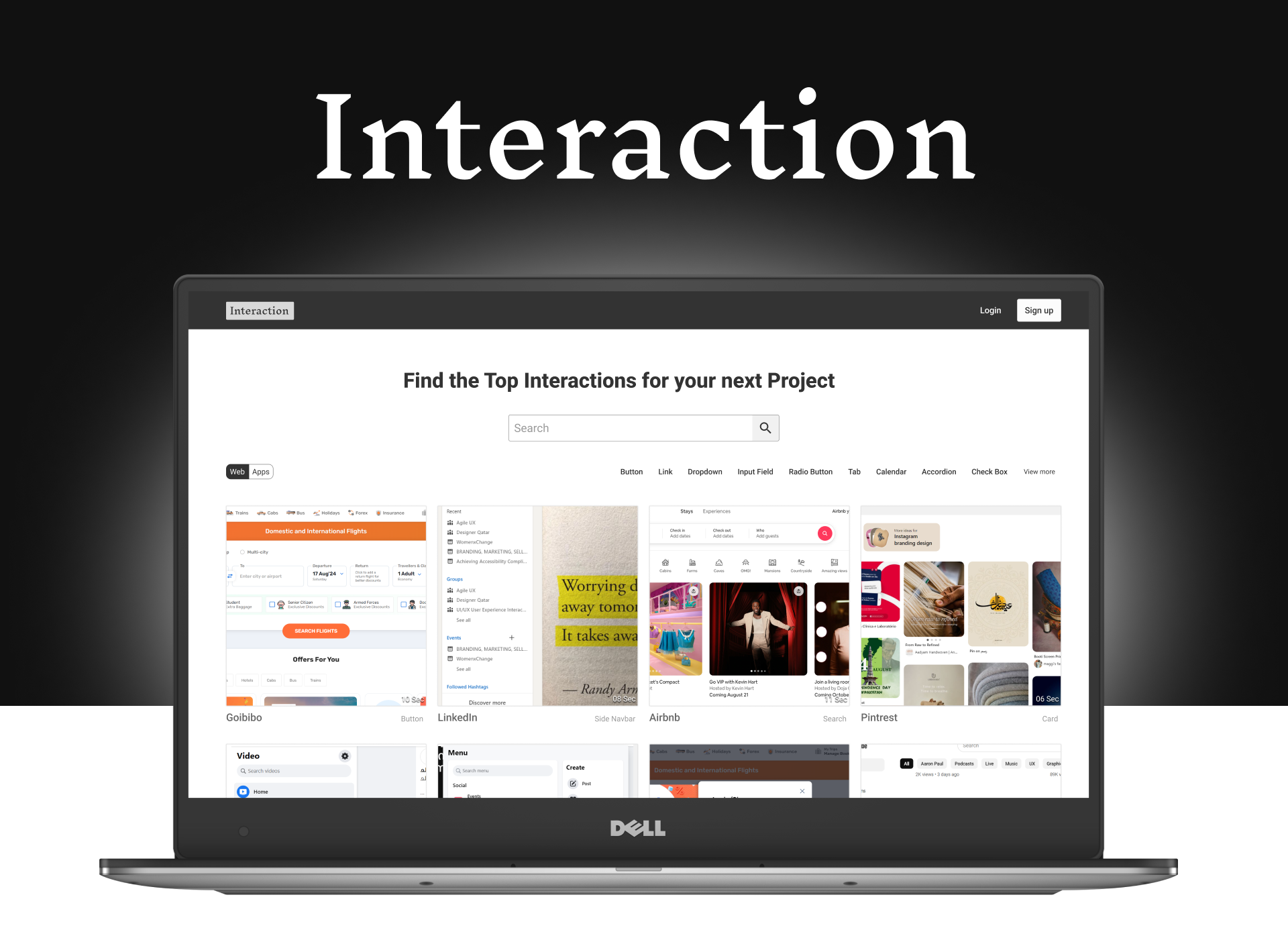
Outcome summary
A high-fidelity concept with a defined taxonomy, intuitive browsing model, and detailed interaction experience.
01 — Overview
What this project is
A centralized platform concept that curates high-quality website interactions in video format, helping designers, developers, and students discover, study, benchmark, and apply modern interaction patterns.
- Problem Framing
- Competitive Analysis
- Information Architecture
- User Flows
- Interaction Thinking
- High-Fidelity UI
02 — Context
What was happening before
What was happening before this project started?
Why was this problem important?
Who was affected?
What triggered the need for a solution?
03 — Problem Space
Where this product lives
- Primary audience
- UX/UI designers · Front-end developers · Design students
- Background
- Digital professionals and learners interested in interaction design, motion, web experiences, and front-end implementation.
- Environment
- Global / digital design and development environment
- Device
- Desktop / web — structured as a web-based interaction resource platform
- Digital comfort
- High — already comfortable with design and development tools
- Market / domain
- Interaction design · UI/UX · Front-end development · Inspiration · Design education
04 — Core Mechanism
How the product works
The main journey, the tasks that matter, and the friction that had to be designed out.
01
Discover
Land on the interaction library
02
Search / Browse
By platform or pattern
03
Filter
Narrow to a specific interaction type
04
Watch
Video preview of the interaction
05
Explore details
Type, platform, company
06
Analyze
Motion, timing, feedback
07
Get resources
Related interactions and files
08
Apply
Use as reference in real work
Top user tasks
- 01 — Discover interactions: find relevant interaction examples
- 02 — Study interactions: watch micro-interactions, transitions, hover effects, loading states
- 03 — Apply the inspiration: use examples and resources as design or development references
Information architecture
- Browse by platform: Web · iOS · Android
- Browse by interaction type and company
- Interaction examples, search, and related posts
- Articles and resources
- Categories: button, link, dropdown, input field, radio, tab, calendar, accordion, checkbox, card, loading, navigation, search, signup, modal, map, and more
Friction points
- Interaction examples are scattered across different sources
- Static screenshots cannot effectively communicate motion
- Inspiration platforms focus on complete websites rather than individual interactions
- Finding a specific interaction pattern can require considerable searching
- No direct way to study dynamic behaviour
What was simplified
- Centralized individual interactions into one categorized, video-based browsing experience
- Structured a taxonomy by platform, interaction type, company, and category
- Designed the interaction detail page around the video, not the whole website
- Kept discovery flowing with related interactions and resources
05 — Research & Competitive Landscape
What already exists
Platforms reviewed during the conceptual exploration, and the gap they left open.
Refero
Strength
Large library of website screenshots.
Weakness
Static content makes dynamic interactions difficult to study.
Awwwards
Strength
Showcases high-quality website experiences.
Weakness
Focuses primarily on complete websites rather than individual interactions.
Identified opportunity
A centralized platform for video-based exploration of individual web interactions — the opportunity identified during this conceptual exploration, not a market-validated gap.
01
Website inspiration
02
Individual interaction inspiration
06 — User Flow
From landing page to resource
01
Landing page
02
Search / browse
03
Select platform or interaction type
04
View interaction cards
05
Open interaction
06
Watch video
07
Explore related content / resources
07 — Interaction Detail Experience
Exploring one interaction, not a whole website
Video is used because it shows how an interaction behaves over time. Implementation detail is only covered where resources such as GIFs, Lottie files, or source references are provided.
01
Interaction preview
02
Video
03
Interaction type
04
Platform
05
Company
06
Details
07
Related interactions
08
Resources
- Motion
- Transition
- Hover behaviour
- Loading behaviour
- State changes
- Timing
- Interaction feedback
08 — Key Insights
How the experience feels
Before
- “Where can I find a good example of this specific interaction, and how does it actually behave?”
- Searching across multiple sources for one pattern
- Static screenshots that show states but not motion
After
- Curiosity
- Inspiration
- Confidence
- Discovery
09 — User Dynamics
How people actually behave
- 01Need inspiration
- 02Discover interaction
- 03Watch / analyze
- 04Learn
- 05Apply to project
- 06Return for another interaction
Loop repeats from the last step.
Observed behaviors & workarounds
- Users relied on multiple external sources and individual websites to find interaction examples
- Existing platforms offered static screenshots or complete website showcases, not isolated interactions in video
- Repeated behaviour: search → watch → explore → compare → learn → apply → discover another interaction
- Concept features explored to strengthen the loop: related recommendations, curated content, tasks, articles, community, rankings, badges, subscription rewards
10 — STAR Story
Situation, Task, Action, Result
Situation
Designers and developers often need to study subtle interactions — micro-animations, transitions, hover effects, loading states — but these examples are scattered across platforms and usually presented as static screenshots.
Task
Design a centralized platform that curates and showcases high-quality website interactions in video format, so designers, developers, and students can discover, study, benchmark, and apply modern interaction techniques.
Action
I explored the interaction-design resource landscape and analyzed existing platforms to identify gaps in how dynamic interactions were presented. I structured the information architecture around interaction types, platforms, companies, and categories, then designed the user flows, wireframes, visual system, browsing experience, interaction-detail pages, and high-fidelity UI. I also explored features such as search, filtering, related interactions, downloadable resources, article contributions, tasks, rankings, badges, and subscription rewards.
Result
A centralized, video-driven platform for exploring individual interaction patterns, combining curated examples, learning resources, community contributions, downloadable files, and gamification. Focused on improving interaction discovery, engagement, resource sharing, and repeat exploration.
11 — Before / After
What changed
Before
- Scattered searching across multiple sources
After
- Centralized discovery
- Focused analysis
- Learning
- Application
12 — Final Screens
Screens and decisions
Each visual is captioned with the design decision behind it.
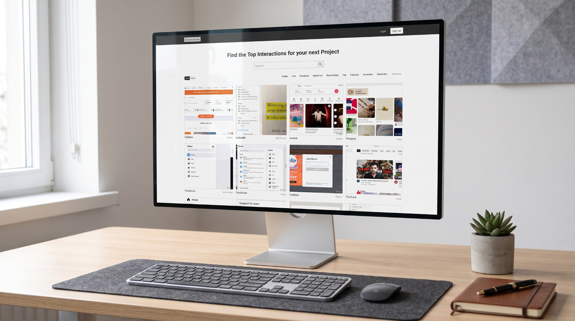
Library grid: video cards with category, company, and duration so motion is scannable without opening every item.
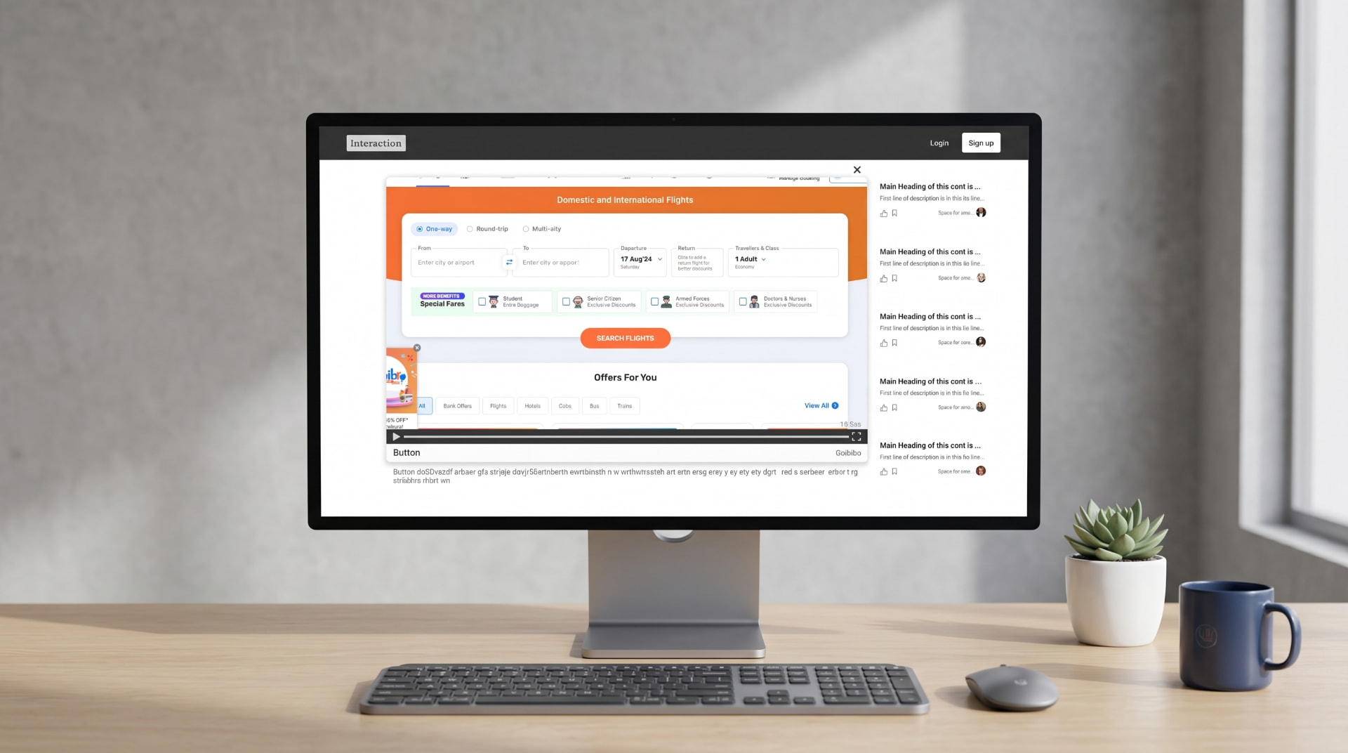
Interaction detail: the video leads, with type, platform, company, related interactions, and resources around it.
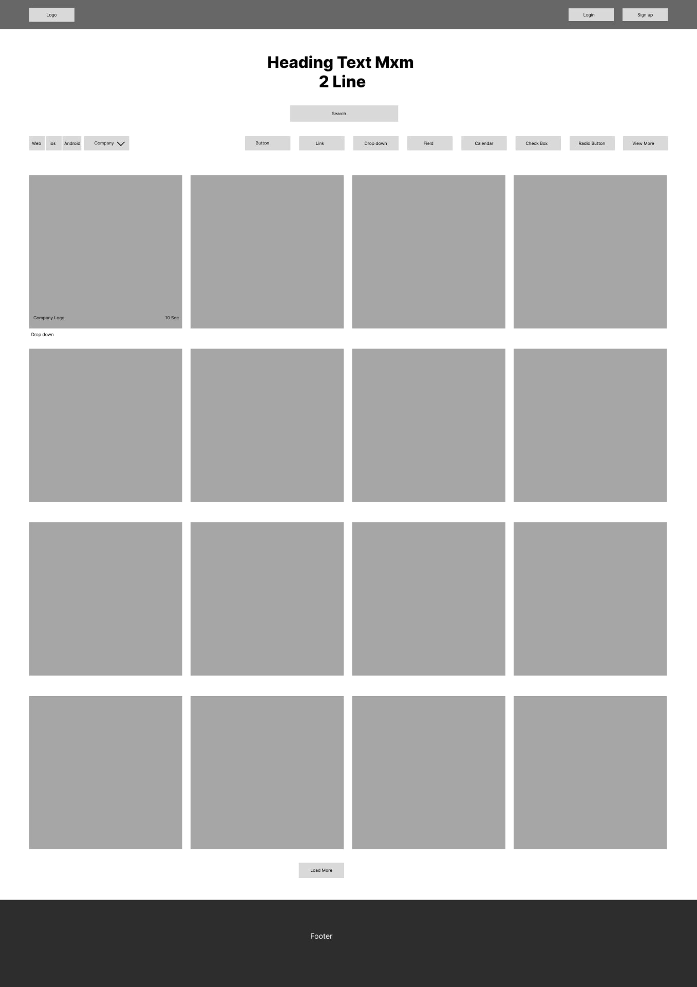
Wireframe: browse experience with search, filters, and a dense card grid.
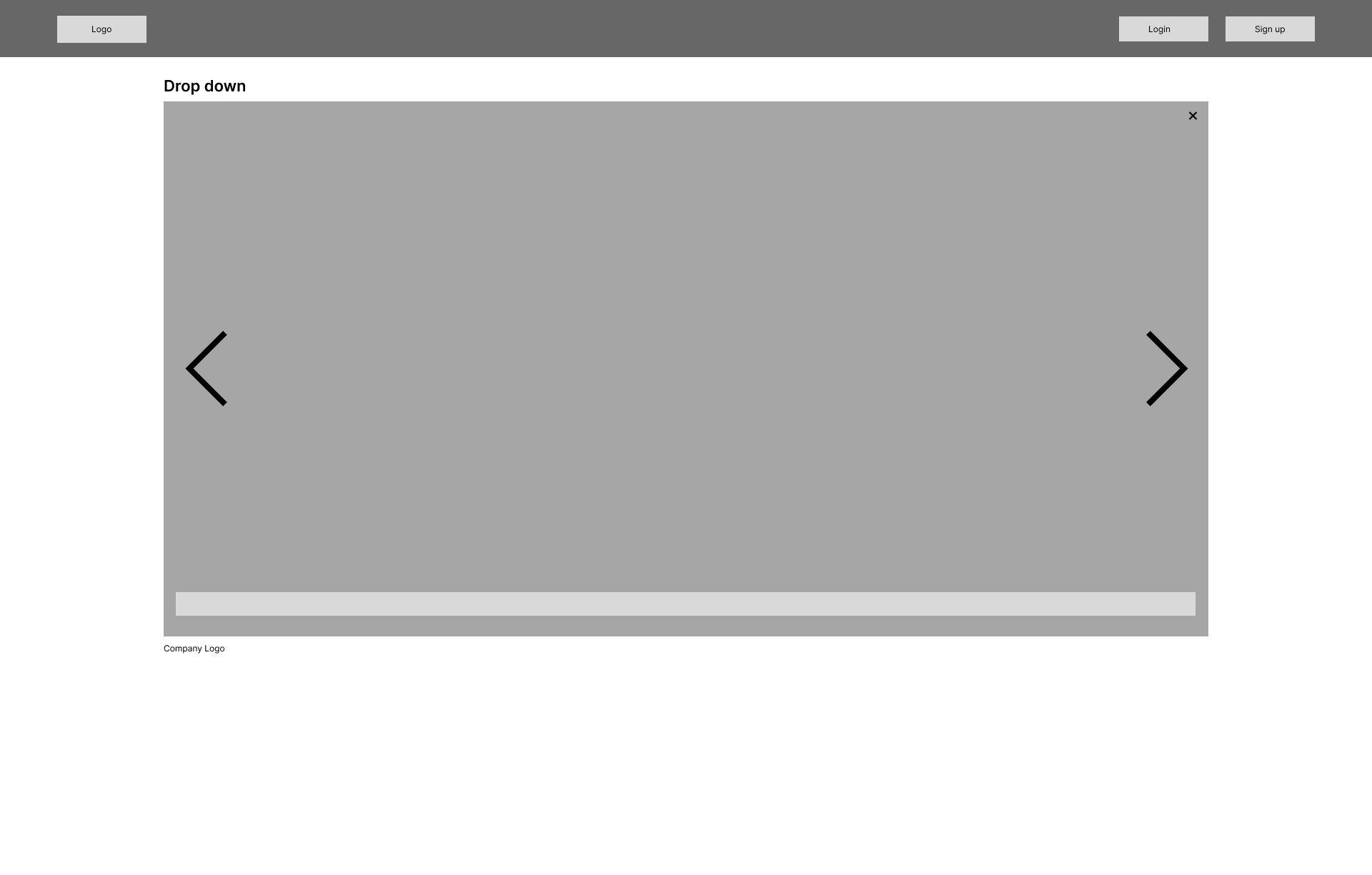
Wireframe: interaction detail view with video player, scrubber, and prev/next navigation.
Interactive prototype walkthrough.
13 — Feedback Loops
Conceptual loops in the system
Discovery loop
- 01Interaction viewed
- 02Related interactions
- 03Further exploration
Learning loop
- 01Watch
- 02Analyze
- 03Learn
- 04Apply
- 05Return
Community loop
- 01Article published
- 02Views / likes / comments
- 03Recognition
- 04More participation
Conceptual loops — not measured behavioural results.
14 — Key Features
What the concept includes
Interaction Library
Video-based interaction examples.
Search & Filters
Browse by platform and interaction type.
Interaction Categories
Buttons, links, cards, loading, navigation, inputs, tabs, and other patterns.
Related Interactions
Discover similar interaction patterns.
Resource Hub
GIFs, Lottie files, and source references.
Concept feature
Articles & Community
Share tutorials, trends, and interaction knowledge.
Concept feature
Gamification
Rankings, badges, tasks, and rewards.
Concept feature
Subscription Rewards
Explore premium features through engagement.
Concept feature
Items marked as concept were explored during the design process and are not launched features.
15 — Visual Design Direction
How the UI supports discovery
- #333333
- #666666
- #888888
- #999999
- #E1E1E1
- #F1F1F1
- #FFFFFF
- A restrained grayscale system and strong typography keep attention on the interaction examples themselves.
- Video previews make dynamic behaviour immediately visible.
- Categorization, search, and filtering help navigate a large collection.
- Interaction cards, duration indicators, company names, and categories support discovery and comparison.
Design trends considered
- Micro-interactions
- Motion and transitions
- Mobile-first interactions
- Responsive experiences
- Motion-driven usability
- Reduced cognitive load
16 — Learnings
What I take forward
01
A clear taxonomy is the product in a resource platform; the UI expresses it.
02
Video-first content needs strong scanning affordances to stay browsable at scale.
03
Treating the smallest meaningful unit — one interaction — as the object of discovery reframes the whole experience.
04
Conceptual work still needs measurable success criteria defined up front for future validation.
17 — Key Takeaway
What this project proves
The project explored how interaction inspiration could move from scattered, static references toward a focused, video-driven learning and discovery experience. The strongest design decision was treating the individual interaction — not the entire website — as the primary unit of discovery.
18 — Next Project